How to choose and use colour schemes for the home.
Find inspiration for your colour scheme
Our clients and designers find colour scheme inspiration from several different sources including, the garden, a piece of art or furniture in their collection, the exposed architecture of a property, or the broader interior themes of the home.
The colours, materials, and tones are selected to complement the focus. The use of natural wood or earthy tones can bring a sense of the outdoors into the room. A more muted, neutral kitchen furniture palette would move the room's attention towards a painting or sculpture. Or, large swathes of uniform colour would provide a pleasant contrast to exposed brick or timber.
HOW COLOURS WORK BEST
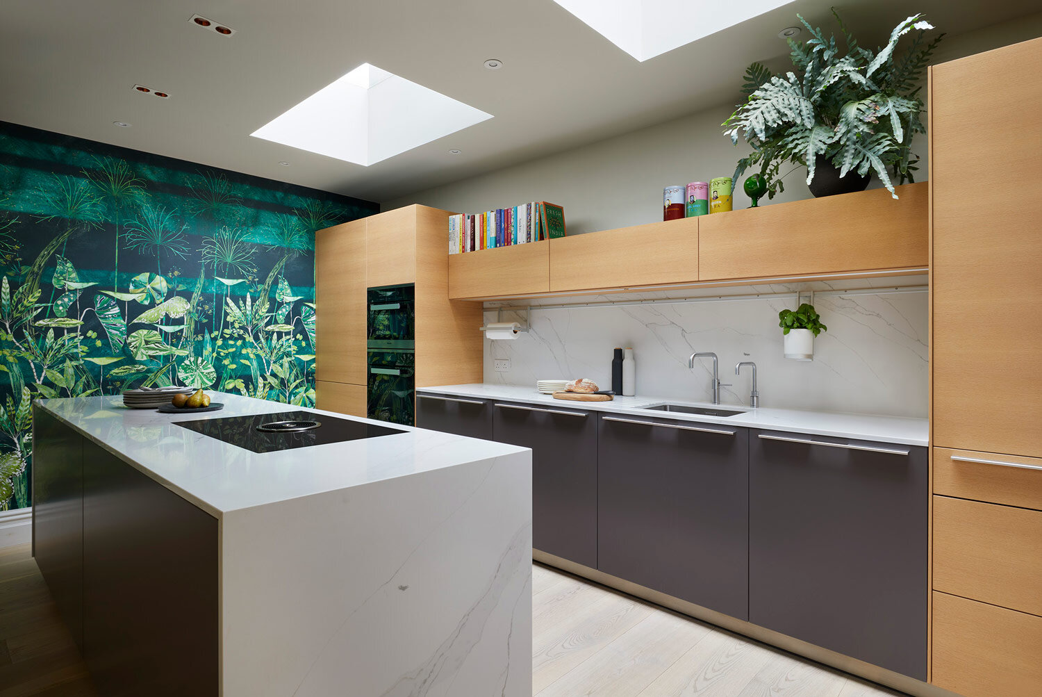
Working to a 'rule of 3' for colour choices can also bring a sense of dynamism and interest to a kitchen space. As a guide, 60% primary colour, 30% secondary and 10% accent. This could translate into cabinetry, the kitchen island and/or the wall units – as shown in this client’s bulthaup kitchen project.
The kitchen, now considered more of an open-plan social space, can take accents or cues from other areas of the property, linking it with the dining room or lounge. This creates a flow and a more coherent overall interior style philosophy.
Practical Considerations
The kitchen size, the position within the property, and the time of day the space is used most often can all influence the suggested colour scheme of the room. For example, lighter tones and careful consideration of artificial illumination in a more compact space, or a room that doesn't benefit from natural light at the busiest times, would increase the perceived space. Alternatively, in a larger, more open-plan area, a darker cabinetry choice can create a striking focal point to the room.
Suppose a room has a darker area by virtue of the layout or more deliberate means. In that case, it can be designed to act as a different setting, a 'cosy corner' or 'book nook' - part of the overall space but individual in the use of colour and style.
Testing your Colour Choices
Suppose you are trying to understand how a new wall colour may look in your home. In that case, we advise taking a number of pieces of A4 paper, painting them with a sample colour, and attaching them to different walls. Leave the paper in situ over the next few weeks and as you enter the room at other times of day, see what you think. Does the colour change under natural and artificial light, and can you live it?
Paint charts are a valuable tool when designing an interior colour scheme, and not just for the walls. The colour charts can be just as helpful in choosing accessories and furniture, so don't throw them away when the brushes have been put away!
Through client conversations and property surveys, our designers build up a picture of the style and taste of the homeowners. This understanding then guides the proposed choice of finishes, presented as a collection of samples that our clients often take away to review at home. When thinking about your own scheme, try asking yourself questions that make you think about your likes, dislikes, and style choices.


